Tuesday, June 24, 2008

Isopachs


http://www.volcano.si.edu/volcanoes/region14/nicarag/cerroneg/14neg13f.png
Here is an isopach map displaying the ash fall from the Cerro Negro Volcano in Nicaragua. Isopach maps are frequently used to assist geologists. They map the areal extent and thickness variation of a stratigraphic unit.

--------------------------------------------------------------------------------

Sunday, June 22, 2008

Remote Sensing


Image URL- http://www.dcs.gla.ac.uk/~hall/personal/files/Glasgow-Satellite.jpg
This image is of Glasgow, Scotland. It is the largest city in Scotland and the third most populated in the United Kingdom. This image depicts many different features of Glasgow, one in particular being the University of Glasgow. This University is well known for contributing to the Scottish Enlightenment. Many other features can be seen such as the River Kelvin.

Univariate Choropleth Map


A univariate choropleth map displays a single data set. Here only one set of data is displayed regarding poverty in the United States. http://www.cdc.gov/pcd/issues/2007/oct/images/07_0091_02.gif

Unstandardized Choropleth maps


Unstandardized choropleth maps utilize raw numbers when displayed. In the map displayed the data displayed is not averaged.
http://www.smri.nl/gfx/ajp2002graph.gif

Standardized choropleth maps


Data in choropleth maps are standardized to allow comparison of distribution among different areas. Here is a map of Canada displaying the different area's population of people age 14 and under.
http://www.statcan.ca/english/research/92F0138MIE/2008003/figures/figure3.1-en.jpg

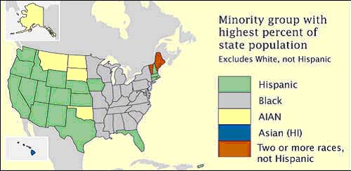
Nominal area choropleth map


Nominal area choropleth map is a choropleth map that is used to dispaly nominal data. Here is a map with nominal data showing which state's minority group has highest percentage of state population.

Bilateral Graph


http://www.globalhumanitarianassistance.org/New%20Images/Growth%20in%20bilateral%20humanitarian%20assistance%202005-2006%20copy.jpg
A bilateral graph depicts increases on one side of a zero line and a decreases on the other side. Bilateral graphs are used to display data when there is both positive and negative values. Here you can see increases and decreases in humanitarian services in various countries.